Guardians Of The Galaxy: How One Artist Inspired The Look Of The Entire Movie
This article is more than 2 years old
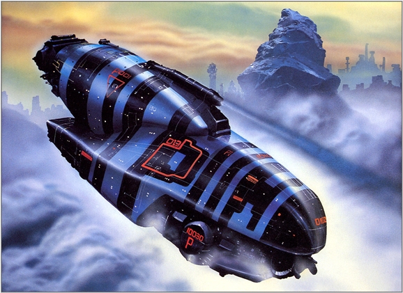
There’s a lot to love about Marvel’s Guardians of the Galaxy. The crackerjack script by director James Gunn and Nicole Perlman is funny, fast-paced, and evocative of classic flicks like Star Wars and Raiders of the Lost Ark. The dynamite cast all inhabit their roles perfectly, and have (inter)stellar comedic chemistry with each other. And overseeing it all, Gunn conjures up a detailed, colorful world I can’t wait to return to again and again. And that word — “colorful” — is an important one. In a genre where outer space is all too often rendered in shades of black, white, and grey, Guardians plays with all the other crayons, and that creative choice owes a lot to the work of one artist — Chris Foss — and, even more specifically, to the image below.
Even if you don’t know Chris Foss’ name, you almost certainly know his work. The British artist has lent his talents to countless science fiction covers over the years, including editions of Isaac Asimov’s Foundation trilogy, E.E. “Doc” Smith’s Lensman books, and one of my favorite relics of my childhood, the Terran Trade Authority Books. Last week Gunn shared the above image on his Facebook page, along with this message:
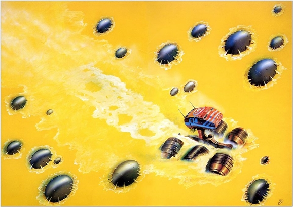
Of all the Chris Foss paintings that inspired Guardians of the Galaxy, this may be the one that inspired us most. Yellow is an underused color in films, especially science-fiction and fantasy films. In Guardians, I used it as a signifier of change, rebirth, and redemption — the yellow prison uniforms, Drax drowning in the yellow spinal fluid, the yellow Groot spores, and the yellow interlocking Nova Corps net… I believe color is a part of what made Guardians successful. When so many huge, spectacle films have the beige color palette of Saw, the brain becomes thirsty for color. We were that technicolor pitcher of water at the edge of the summer desert.
This doesn’t mean all movies should be colorful, just that color in general is important, and too much of one thing is boring. If, over the next few years, films become oversaturated with bright colors, brains will be relieved by a film entirely hazel and gray.
Anyway, this painting, along with other Chris Foss works, was a part of my original presentation to Marvel when I pitched myself as director and I explained the visual direction I was going to take with the film. They were immediately on board, and we ended up hiring Chris Foss to help design some of the spaceships in the film. He was, of everyone, my biggest visual inspiration on Guardians.
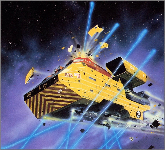
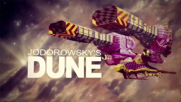
Foss has been one of my favorite science fiction artists — hell, one of my favorite artists period — for just about as long as I can remember. If you’re a regular GFR reader, you’ve likely seen his work numerous times in the past year, courtesy of the image below, which was used extensively in the promotional materials for the documentary Jodorowsky’s Dune. You can see more of Foss’ Dune designs, and you can see even more right here.
You can clearly see Foss’ DNA all over the design work in Guardians, in both general style and in the exuberant use of color Gunn highlighted. Just check out the Nova Corps fighters.

Or Star-Lord’s sweet ride, the Milano (yes, he named it after Alyssa).
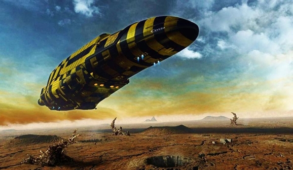
With space-based science fiction making a huge comeback on both the big and small screens, hopefully more productions will draw inspiration from Foss’ brilliance. Who the hell wants to explore space in black, white, and grey? Here are a few more gorgeous Foss images for all your desktop wallpapering needs, and be sure to check out Foss’ official website if you don’t mind it swallowing your whole afternoon.