Terrifying NASA Video Shows Visible Carbon Emissions
A NASA simulation shows carbon emissions, tagged by sources, engulfing our planet.
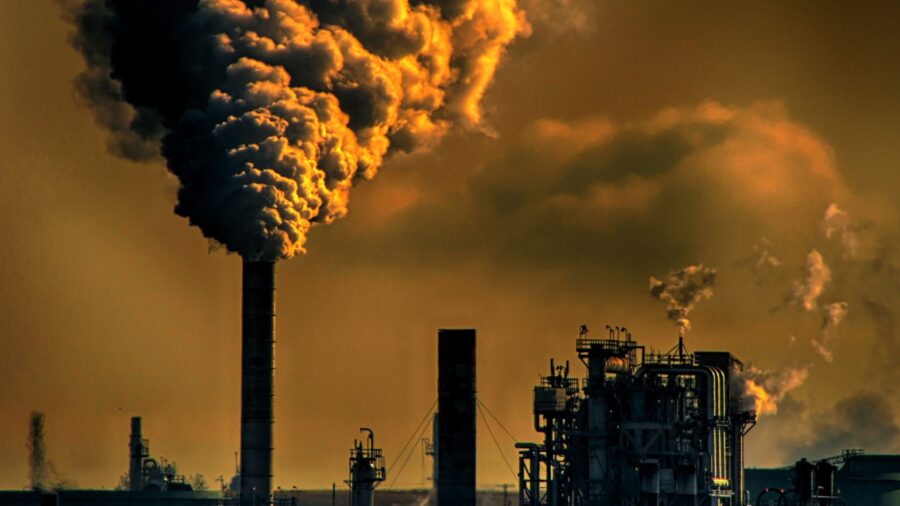
A new video from the NASA Scientific Visualization Studio YouTube channel shows the frightening reality of our current climate crisis. The video shows a model of the Earth as seen from space, with a swirling cloud of orange-brown fog at the top. The fog, representing Earth’s carbon emissions from all possible sources, travels slowly downward until the globe is enveloped in an angry cloud of coffee-colored sludge. See for yourself below.
The video is a simulation created using advanced computer modeling techniques from NASA’s Global Modeling and Assimilation Office. It shows the various carbon emissions from the year 2021, divided into four categories: fossil fuels like gasoline and diesel in orange, burning biomass such as forest fires in red, ecosystems in green, and the ocean in blue.
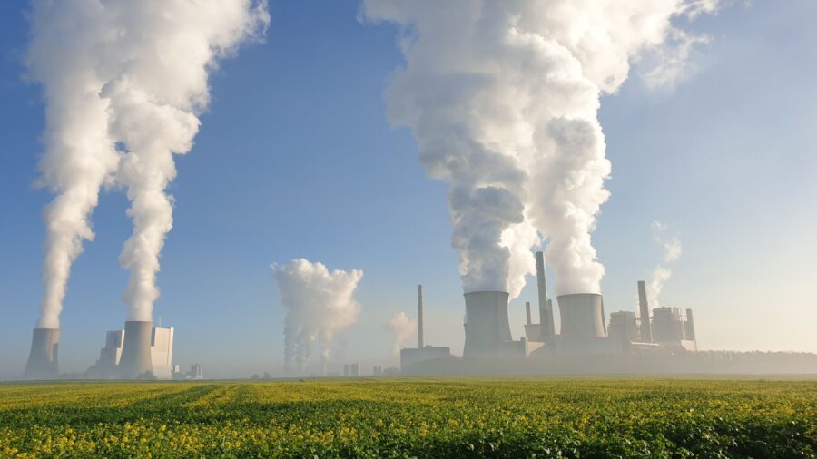
While it doesn’t appear particularly orange to our untrained eyes (then again, who are we to argue with the literal rocket scientists at NASA?), it’s clear that the majority of CO2 is coming from the human consumption of fossil fuels.
This particular visualization focuses on the North/South American side of the globe. The blinking green dots represent the areas where plants absorb the carbon emissions during the day before later releasing the CO2 back into the atmosphere during the night. It’s evident by the simulation that much more carbon is being put into the air than is being taken out, a problem with apocalyptic ramifications.
As the NASA SVS webpage further clarifies, Carbon dioxide is the most rampant factor driving global climate change. The blanket of carbon emissions surrounding the globe trap heat that radiates from the surface of the planet and re-releases it back down to us, causing the global temperature to rise and weather to behave erratically.
In other words, the world is currently like one giant car sitting in a garage with one end of a hose attached to the exhaust and the other one pointed directly at humankind.
In the above model, one of the biggest contributors to the orange-ish cloud of death is the USA’s “urban corridor” that runs from Washington D.C. to Boston, in a separate model on the SVS page that focuses on Asia and Australia, the majority of carbon emissions emanate from China. In yet another model, this one showing Europe, The Middle East, and Africa, the guilty climate culprit appears to be Europe.
In all the models, there is an area that represents a large carbon sink. In the above video, it’s the South American rainforest. In the others, it’s Australian and African farmland.
One frightening thing all three models have in common is that the areas that absorb the carbon emissions are all woefully underpowered in comparison to the smog on steroids that’s whirling around them. The CO2 eventually engulfs the green areas in the models, making them all but invisible.
The visuals are scary and are most likely intended to be in an attempt to shock the global populace into action. Something the NASA models make quite clear is that this issue is much bigger than plastic straws and recycling cans.
While personal efforts to help the environment are noble and always something to be applauded, only a widespread change in the way corporations operate globally will likely have a significant chance of lowering the planet’s carbon emissions.