Death In The 20th Century Infographic
This article is more than 2 years old
Looking back at the 20th century, during which I lived my first 18 years, I can remember so many good things about life, and the rapid developments in electronics and medicine made it an exciting time to be alive. That is, for those people who stayed alive.
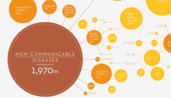
As commissioned in November 2012 by the Wellcome Collection to create a piece to accompany their exhibit “Death: A Self-Portrait – The Richard Harris Collection,” designer David McCandless created the below infographic, which gives estimated but informed totals for all the different ways people died during the 20 century. His use of warm reds and bright yellows do their part to buoy viewers’ spirits, but this is a tidal wave of humbling facts that force part of the brain to consider the fate that awaits it. I’ll have to assume by its lack of an inclusion on the list that “smothered by perky breasts” isn’t as common a way to go as I’d hoped. The image below is just a small part of the huge infographic, but you can click here for the full-size version. It’s more than worth your time, while you still have it.
If you’re the one person who died while reading this infographic, don’t expect anyone to make another one to include you. I’d prefer not to discuss any of the diseases and avoidable causes in detail, because it’s the weekend. These is totally a Monday infographic.