The CW Changes Name And Logo
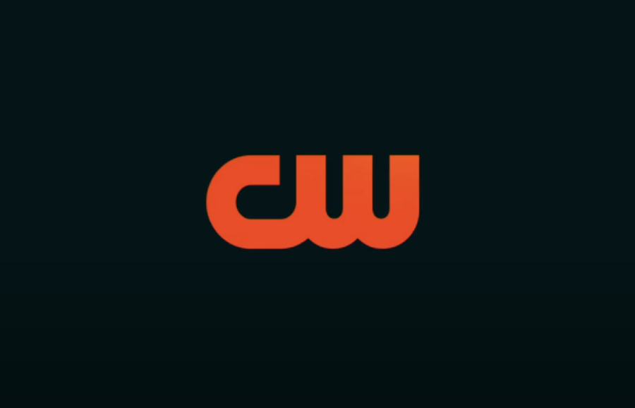
The CW Television Network, most commonly referred to as “The CW,” decided to spruce up its looks by unveiling the new “evolution” in its logo design and brand identity. This includes dropping the definite article in its name, using the network’s previous font in its logo design, and color-scheming it to a single solid color, the orange-reddish “hot sauce” hue.
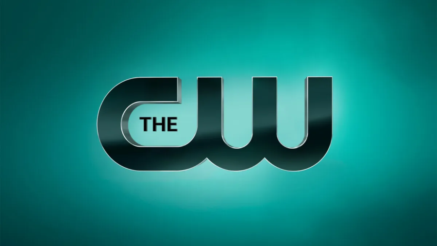
The unveiling of the newly redesigned logo occurred just days before the CW, now known as CW, was set to air the 2024 Critics Choice Awards. According to CW’s chief marketing officer, Chris Spadaccini, the network is currently in the middle of brand transformation and deserves a new look and feel. He also added that the logo was slightly dated, and there was zero consistency in how the network presented itself as a brand. Now, the lack of defined branding behind the network is gone, and everything looks a bit different.
The removal of the definite article from CW’s name results from the logo makeover since the article wasn’t readable. The main issue with it was the fact that it wasn’t really designed with mobile platforms in mind, and it doesn’t reduce down well to other digital formats. It was largely unreadable in streaming, most definitely not readable in social media, or anything with a smaller screen format—like smartphones and other mobile devices, where CW largely engaged with its customers.
The shortened logo, though visually more appealing, doesn’t impact how the network is referred to by the audiences. The CW is still pretty much “The CW,” but the definite article in its name is now implied rather than being in the logo. Other changes, at least when it comes to visuals, really aren’t radical, and most of them relate to the logo, its font, formatting, and the fact that it’s no longer green but hot-sauce orange, which makes the logo much more discernable now.
The color choice landed on the hot-sauce orange following careful consideration and color mapping. Blue was the initial choice, but that color space is very cluttered between Disney, MAX, Amazon, and Fox, all of which have some shade of blue color dominating their color scheme. The CW marketing people wanted to stay away from that particular color space to make themselves more discernable, landing on the hot-sauce orange for its logo, which is supplemented by pink icing against a dark mint green.
Apart from its logo change, the CW has renewed a few of its original series, all of which are expected to premiere at some point in 2024. His includes Superman & Lois, Walker, All-American, and All-American: Homecoming, which are some of the network’s biggest shows and best performers when it comes to views. The successful track record of these particular releases allows the CW to negotiate with CBS and Warner Bros., which feature these on their own platform, and the same applies to Netflix and HBO sales.
The CW redesigns rolled out this Sunday on streaming, and all other media channels CW relies on to reach its customers.