Madame Web Poster Looks Like A Parody Of Superheroes
Good movie posters are a lost art. Nowhere is this more evident than with the two laughable Madame Web posters Sony just put out. The studio unveiled its new “art” via Sony’s X account, and all we can say is they look like the CEO’s five-year-old niece was playing around with Photoshop and someone at Sony said, “Eh, good enough.”
The Dakota Johnson Madame Web Poster
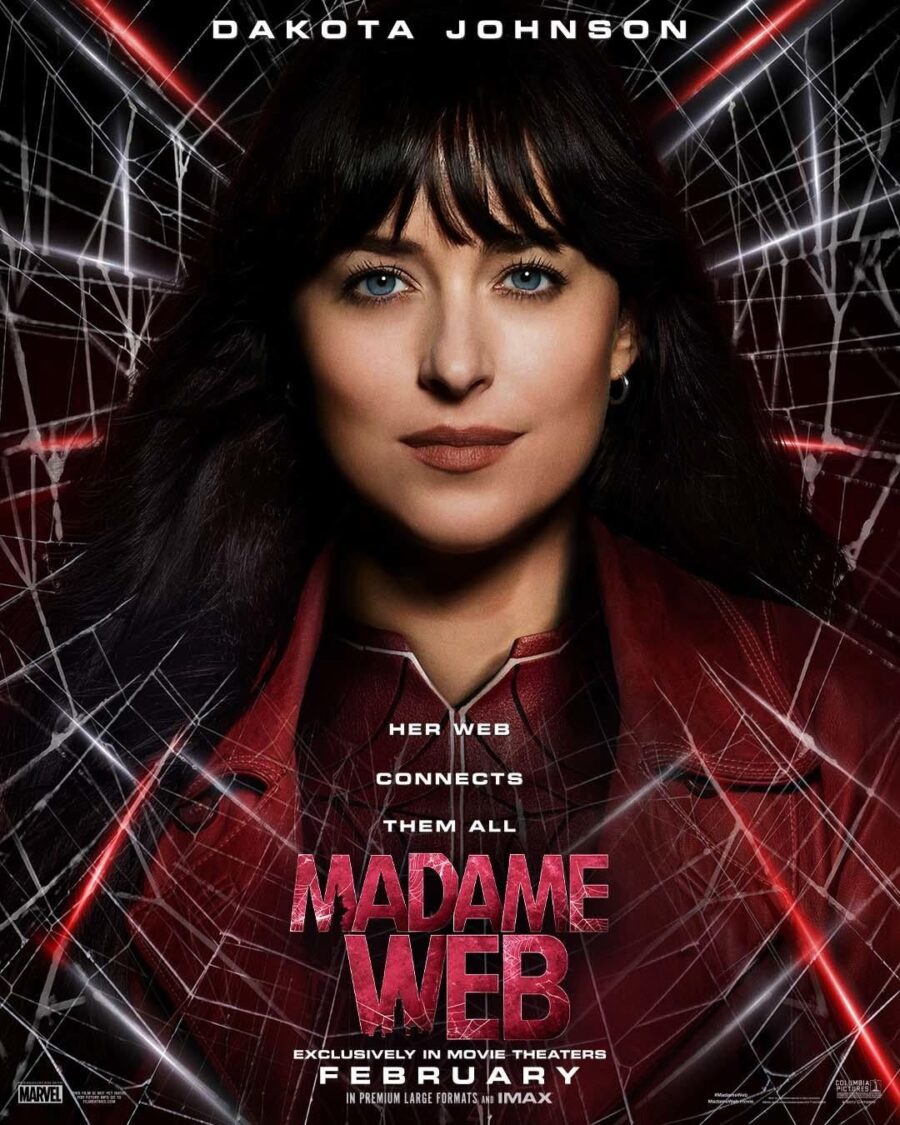
The first image features Dakota Johnson’s face awkwardly pasted over a webbed background with the tagline “Her web connects them all.” Johnson looks oddly fake on the poster—over-airbrushed with disappearing hair. The poster also gives us our first glimpse at the Madame Web logo, which isn’t great.
The font is okay, but making the logo red with white webs on a poster where the bottom half is also red with white webs was certainly a choice. Also, the poster’s designer—and we use that term loosely—apparently thought shoehorning in silhouettes of the Statue of Liberty and the Empire State Building as part of the “M” and “W” was a good idea. It was not.
Lucas Lee Posters
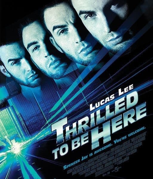
Look, we’re not looking for things to nitpick, but the whole thing looks like one of the fake Lucas Lee movie posters from Scott Pilgrim VS. The World. While the poster isn’t as egregious as the Rise of Skywalker poster that used a picture of the Hot Toys Palpatine figure rather than a picture of the actor himself? No, but it’s not much better.
The Second Madame Web Poster
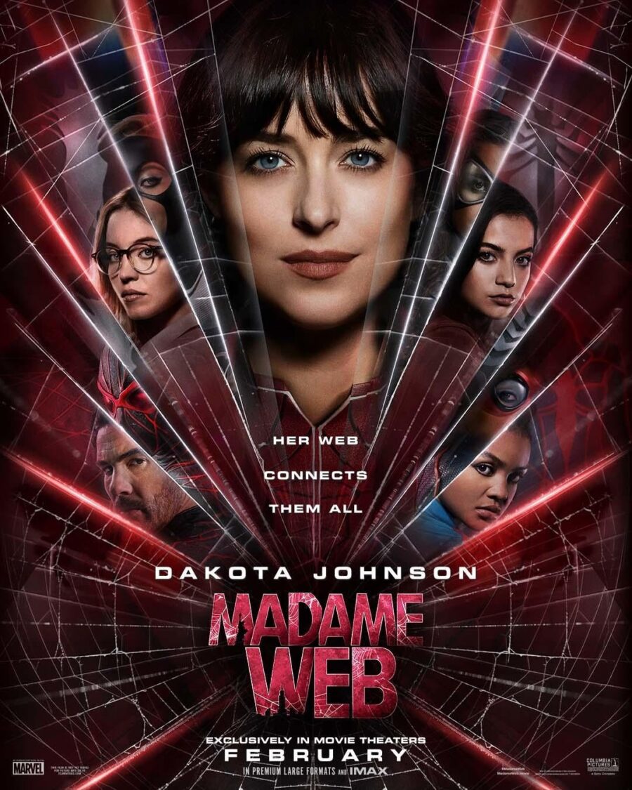
Speaking of not much better, that also describes the second Madame Web poster Sony released. Still the same dead-eyed, fake-looking picture of Dakota Johnson smack dab in the middle, but now she’s surrounded by equally fake-looking pictures of her co-stars. The co-stars—Sydney Sweeney, Isabela Merced, Celeste O’Connor, and Tahir Rahim—in turn, have slightly transparent images of their costumed selves above them and even more transparent images of what we assume is their chest symbols behind those.
It’s not that the second poster is too busy—though it is—but rather the composition. Nothing is arranged in a way that is pleasing to the eye, and in fact, the poster is harder to look at head-on than a 3-D Imax screen when you don’t have any glasses. It’s not necessarily Sony’s fault though.
Movie Posters Aren’t What They Used To Be
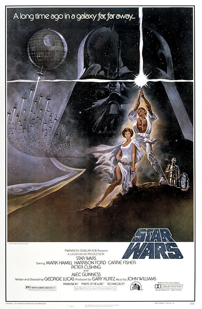
A long time ago, before the internet was a thing, the main way to advertise an upcoming film was with an eye-catching poster. The posters for the original Star Wars and Indiana Jones trilogies, for instance, were fully painted masterpieces depicting a main character or two as the central image and surrounding them with scenes from the film. At some point, however, studios got lazy and cheap and started commissioning movie posters like Madame Web, where it’s just a bunch of faces stuck haphazardly in a rectangle with the movie’s title above them.
Even worse, someone somewhere in the mid-’00s got the idea that all movie posters should be primarily blue and orange. That led to posters like the ones for Spider-Man 2, The Bourne Identity, Night at the Museum, Cowboys VS. Aliens, and every other fire and ice monstrosity that plagued movie theaters throughout the 2000s and 2010s. At least Sony had the decency to make the Madam Web posters a more pleasing combination of red and black.
Madame Web Releases In 2024

That’s, unfortunately, all the praise we can muster up for the pair of amateur-looking posters Sony just put out. Seriously, the Madame Web posters look like they’d be more at home in a Funny or Die parody of Superhero movies than in an actual real-world movie theater.Madame Web crawls into theaters on February 14, 2024.