Star Trek Retro Posters Are On An Errand Of Mercy Into The Deadly Years
This article is more than 2 years old
 Here we are nearing the end of 2013 — which would have boggled the mind of my eight-year-old self, at least until he noticed there were no readily available flying cars and went off to sulk. We’ve just celebrated a holiday that’s ostensibly about family and thankfulness, but that’s usually overshadowed by Black Friday’s annual exploration of the worst impulses humanity has to offer. As you’re rushing about, trying to find the perfect gifts for that special someone, we here at GFR invite you to sit back, put your feet on the table, and relax for a few minutes while you drink in the awesome that is this latest batch of artist Juan Ortiz’s excellent Star Trek retro poster prints.
Last year Ortiz set a mammoth task before himself: creating a retro-style poster print for every single one of Star Trek: The Original Series’ episodes. (He even found time to whip up one for each of the Animated Series episodes.) It’s been a long trip, but Ortiz’ handiwork just keeps coming, and his designs are consistently creative and well-imagined, spanning a wide array of styles and concepts. We kind of love ‘em here at GFR. Now the latest batch has gone up and you can check out all four here, along with Ortiz’s commentary from StarTrek.com. Check it out below, and we’ll have info about where you can order copies of the prints at the bottom.
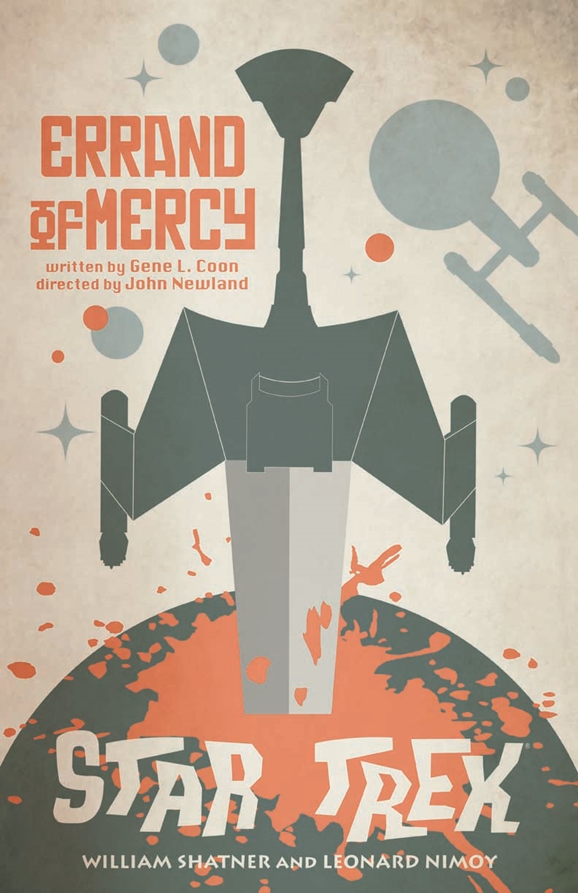
His first print this month is for the 1967 episode “Errand of Mercy,” in which the Enterprise crew butts heads with the Klingons over the loyalty of the peaceful world of the Organians. It was penned by writer/producer Gene L. Coon.
“Errand of Mercy” is clearly a dagger stabbing at the Earth. Take us through your inspiration for this piece.
ORTIZ: It was initially a sword stabbing the planet. But as most fans know, that is the symbol for the Federation in the Mirror universe. So the challenge was to make it Klingon.
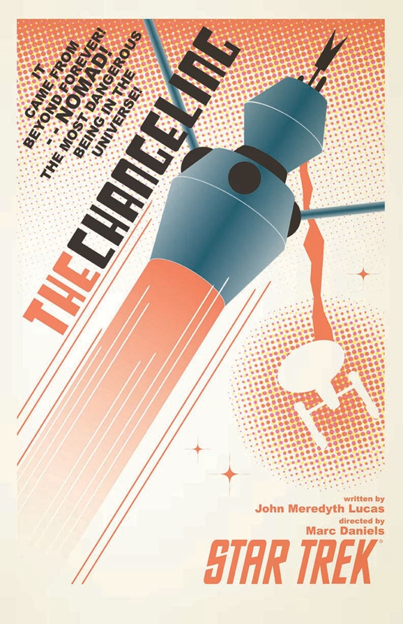 “The Changeling,” originally aired in 1967, introduced the killer space probe NOMAD. Just as Wrath of Khan picked up where the Khan-introducing episode “Space Seed” left off, elements and ideas from “The Changeling” were riffed on again in Star Trek: The Motion Picture. Except ten times slower and with a hot bald lady. “The Changeling” was written by John Meredyth Lucas, who also contributed several other Original Series episodes.
The copy for “The Changeling” and also the imagery (with NOMAD looking a lot like a robot running amok) is very retro and playful. Guide us through coming up with those ideas and then realizing them on paper.
ORTIZ: The image derived from the opening scene where Nomad fires upon the Enterprise. I wanted Nomad to take on a more human-like form. The antennas here work as arms, while his body is removed so that I can add speed-lines. It gave me a sort of “super-villain” feel to it, so I added the copy.
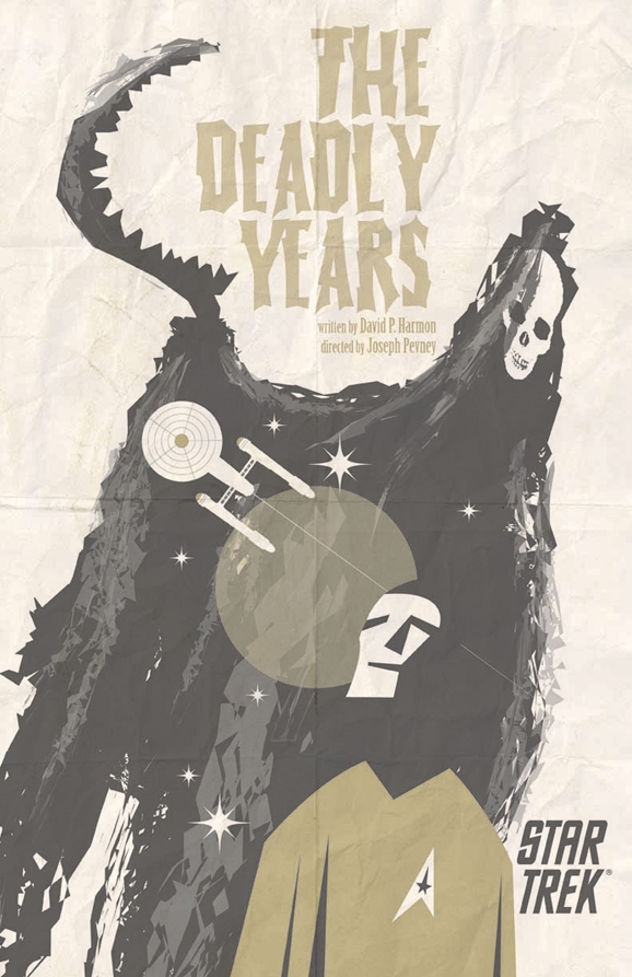 “The Deadly Years” saw the crew of the Enterprise afflicted with rapid aging after exposure to strange radiation. It was written by David P. Harmon, who also, fun fact, wrote 1978’s Rescue from Gilligan’s Island.
“The Deadly Years” has a Seventh Seal feel to it. Are we right there? If so, take us through the connection as you view it. If not, what were you aiming for?
ORTIZ: The only connection between the two would be the appearance of Death. The attempt was more of the implication of Death, looming over the Enterprise as Kirk and some of his crew rapidly aged.
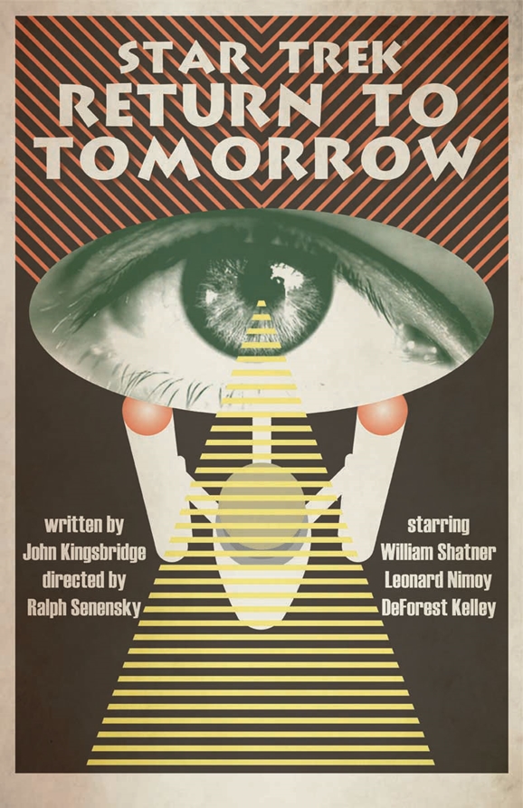 1968’s “Return to Tomorrow” had telepathic aliens taking over Kirk and Spock’s bodies, which is always awkward. Writer John T. Dugan is credited on the episode under the pen name “John Kingsbridge.” Which, I’ll grant, is an awesome name. Dugan also wrote for memorable ‘60s/’70s shows such as Mission: Impossible, Kung Fu, and Little House on the Prairie.
At first glance, the triangle in your “Return to Tomorrow” print looks like a tractor beam, but a closer look at the piece as a whole has the feel of a dollar bill… with the pyramid and the eyeball. What were you aiming for here?
ORTIZ: Although I was aware of the Masonic assertion, it was not intentional. I again turned to Russian posters for my inspiration and I had always wanted to try placing an eye within the Enterprise hull, simply as a design element. The stripes are a recurring element within Russian posters.
By the way, whose eyeball is that?
ORTIZ: I wanted Diana Muldaur’s eye, but I was unable to locate a high-res image. But I would hope that her character in the episode is evoked in the poster. It can also be interpreted as the Enterprise’s eye, since ships are called “she.” In which case, the beaming down concept also works.
Which of the four this month was the hardest to get right, and which came together with the least difficulty?
ORTIZ: The images came to me fairly quickly. It was just a matter of execution. In that regard, “The Changeling” proved to be the most difficult. It was only after altering Nomad’s design that I was able to feel happy with it. “Errand of Mercy” may have been the easiest.
If you were going to display one of these on your wall, which would it be and why?
ORTIZ: My choice would be “The Changeling.” I like the starkness and how gradient dots contrast the straight lines and angles.
If you’re craving copies of these prints for your walls, you can purchase them via the StarTrek.com online store. The prints are available as 18×24 inch “plated-printed lithographs on 100-pound, aqueous-coated, satin-finish paper.” That sounds luxurious to me. You can get a set of all four — or any of the earlier batches — for a mere $34.95.
If you’re across the pond in the UK, you can grab the posters from any of three different websites: Amazon.co.uk, ForbiddenPlanet.co.uk, and Oneposter.co.uk. You can also get the whole lot of Ortiz’s posters in Star Trek: The Art of Juan Ortiz.