How Joker Paid Tribute To The Best Version Of Batman
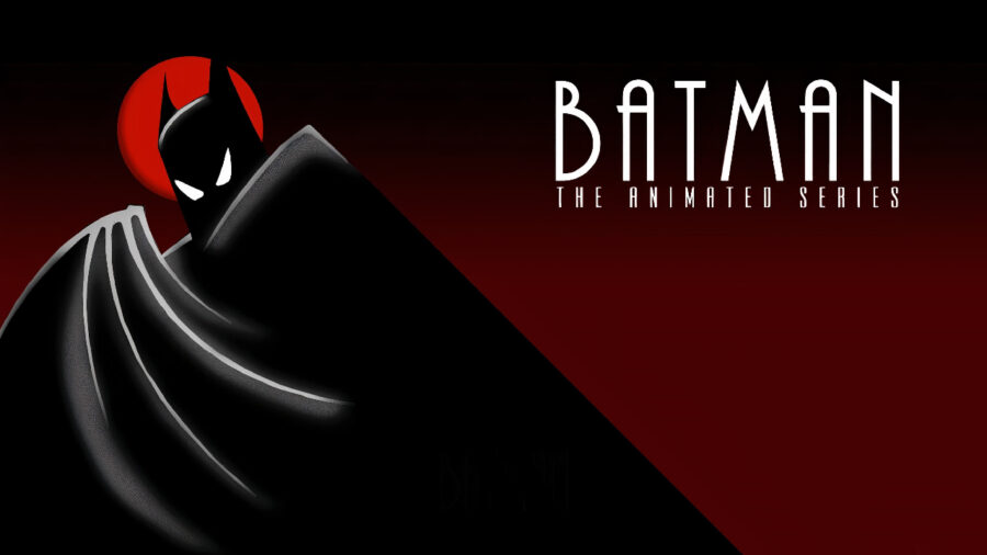
One of the reasons the standalone Joker film was so successful is that it had almost nothing to do with other Batman stories. It certainly had little to do with Batman himself outside of giving us a brief glimpse of a young Bruce Wayne and a longer glimpse at his father Thomas embodying the stereotype of a “wealthy jerk.” However, eagle-eyed fans noticed that Joker actually pays tribute to Batman: The Animated Series by using that show’s font in the logo for Live! With Murray Franklin.
A Tribute Or Coincidence?
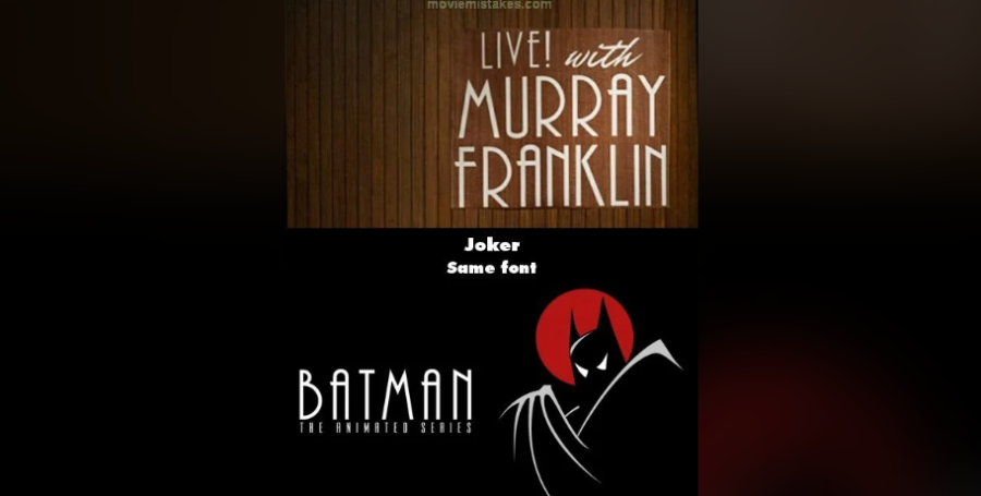
When fans first started talking about how Joker included this sweet nod to Batman: The Animated Series (still the best version of the character, and I will fight you on this), some wondered if this was even an intentional homage at all. That’s because the font used for both that animated series and the fictional Live! With Murray show is called Plaza, and it is used for all sorts of business ventures. Most notably, this is the same font used for The Weinstein Company, which has nothing to do with DC Comics or the Caped Crusader.
With that being said, we doubt that Joker just happened to use the same font as Batman: The Animated Series, especially for its explosive final act. If the use of this font was merely a coincidence, it seems likelier we’d see it somewhere more obscure, like the inside of a newspaper or on a billboard in the background. Instead, it prominently appears as a way of introducing the Joker’s most notorious victim, meaning the appearance of this classy font is indelibly burned into the brains of audience members.
Another Connection
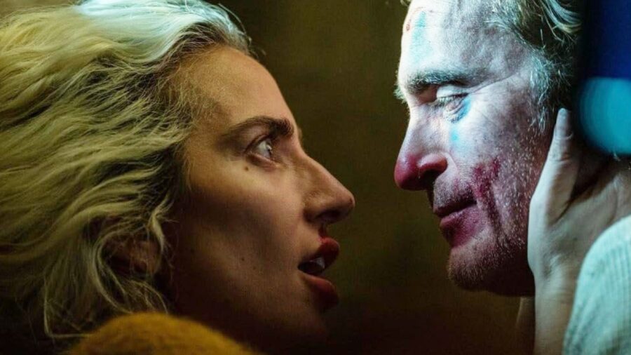
Speaking of that infamous Joker moment, we think there may be a deliberate thematic connection to Batman: The Animated Series in the way this font is used. Most of Joker is deliberately a story setting up the origin of the villain, meaning that we arguably don’t see the man who would become Batman’s greatest foe until the very end. Right before we see the Joker revealed for who he is, we see the same font once used to announce the adventures of our hero being used to announce the arrival of his legendary villain.
A Way To Pay Homage To The Best Version Of Joker
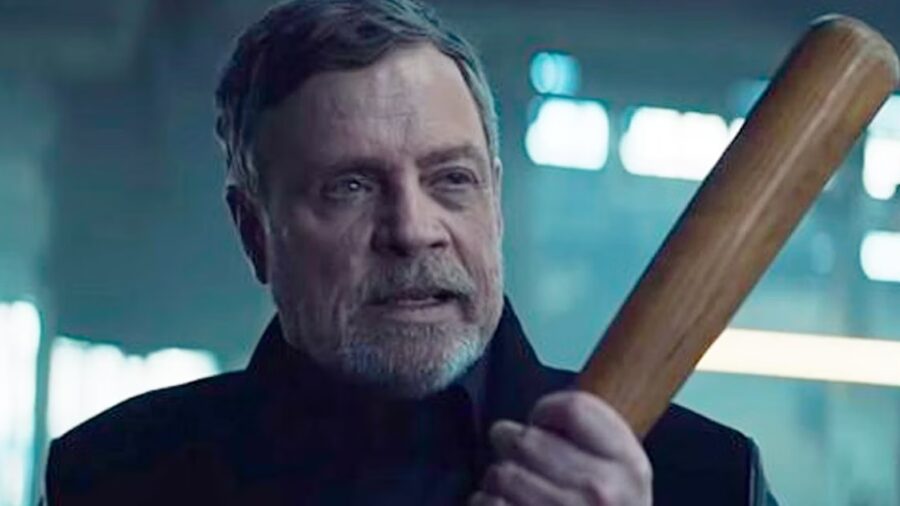
At this point, you might be asking a simple question: since this movie is all about the Joker, why would it heavily feature a font we predominately associate with Batman? My theory is quite simple: Batman: The Animated series introduced Mark Hamill as the Joker, and for many of us (myself included), his version of the Clown Prince of Crime has never been topped. Deliberately drawing our attention to this iconic animated series may have been the movie’s way of acknowledging Hamill’s legendary performance rather than pretending it never happened.
The Font
In case you want to channel either Joker or Batman: The Animated Series, you can do so by purchasing the relevant font. As we noted earlier, the font name is Plaza, and even if they don’t like superheroes or supervillains, those who see your typeface creations will instantly appreciate your Art Deco sensibilities. Incidentally, if you’re not wealthy like Thomas Wayne and would rather have a free version, all you have to do is search for the font named Andes.
The Joker Sequel
Now that a Joker sequel is well underway, it will be interesting to see if this Batman font makes any more appearances. Given that the sequel is a musical featuring Lady Gaga, it’s entirely possible that we’ll even get a musical homage to the font. With that being said, if Gaga looks directly into the camera and says that we can’t read her “P-P-P-P-P-P-P-P-Plaza face,” I’m going to have to walk out of the theater.
After all, the movie can only go downhill from there.