Star Wars Maps Chart The Flow Of The Original Trilogy
This article is more than 2 years old
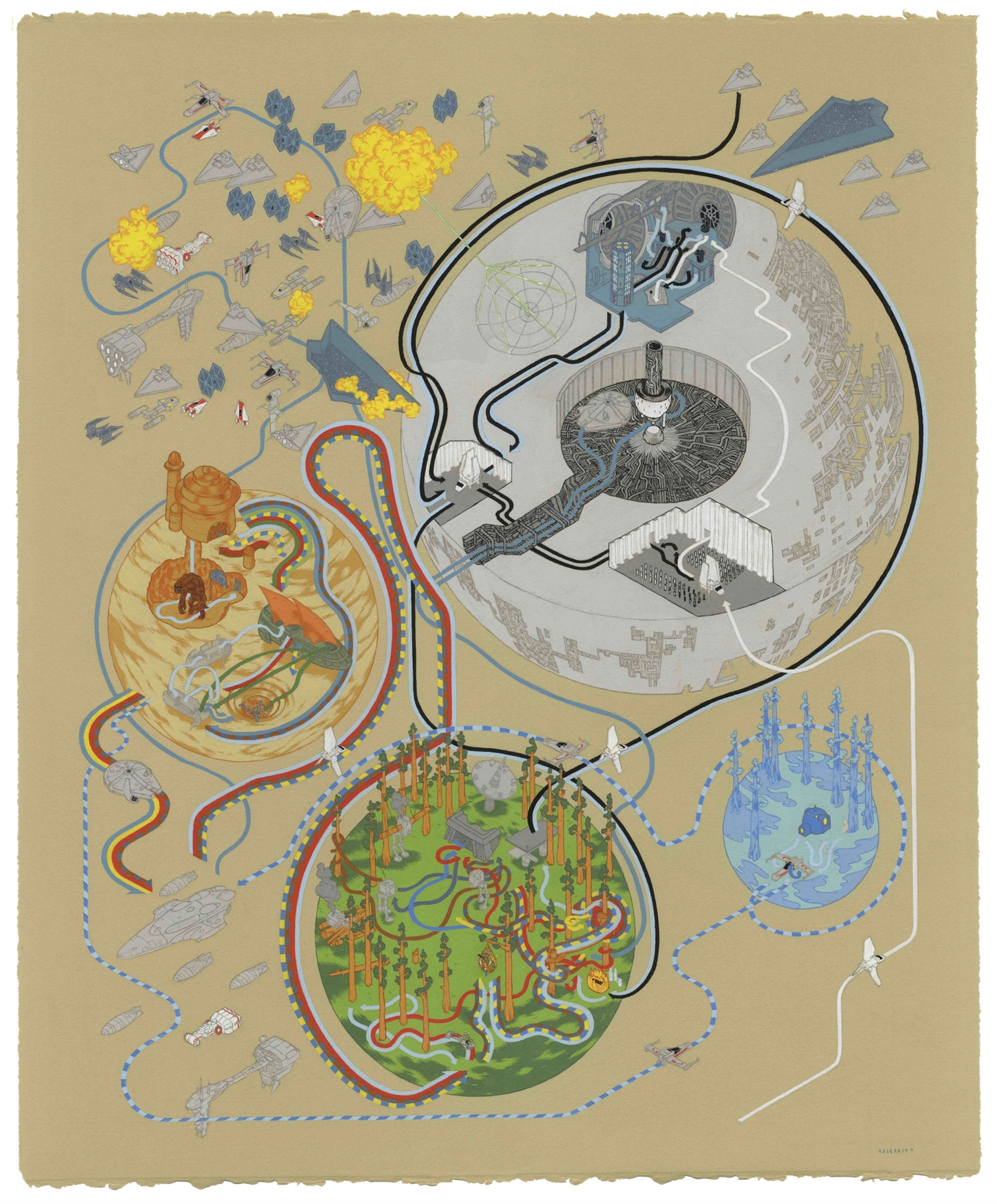
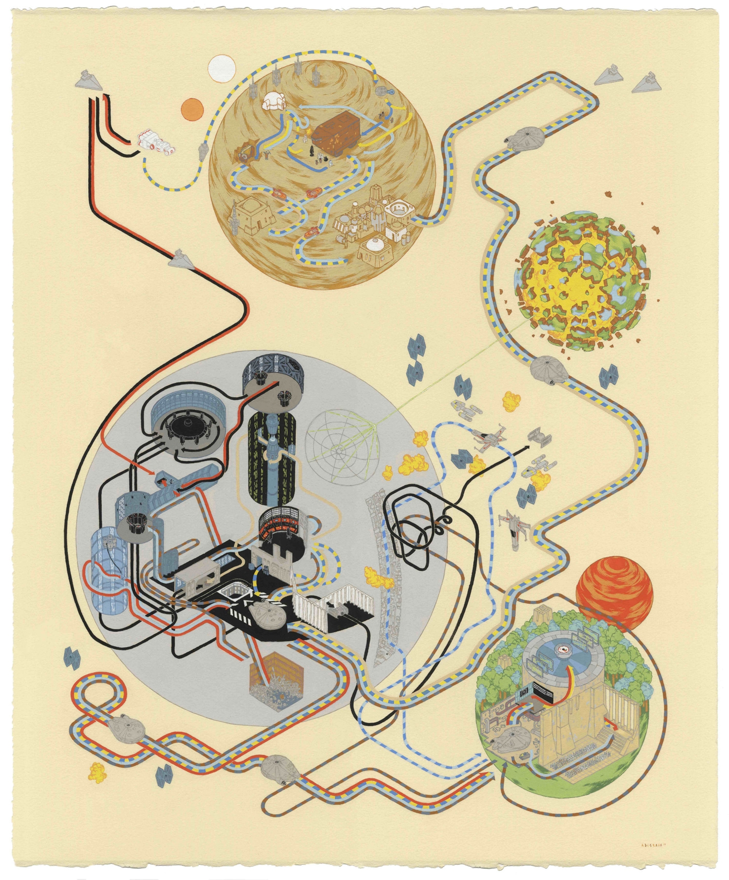
They say a picture is worth a thousand words. Clichéd or not, the images below, created by artist Andrew DeGraff prove it to be true, and then some. DeGraff has taken each of the movies from the original Star Wars trilogy and recreated their story in simplified form, namely as maps. Actually, maps doesn’t really sum it up. They’re more like a bizarre, beautiful hybrid of maps and infographics. Regardless of what you want to call them, they’re friggin’ awesome. Here’s the map for A New Hope (you can click on each of the images for embiggened versions).
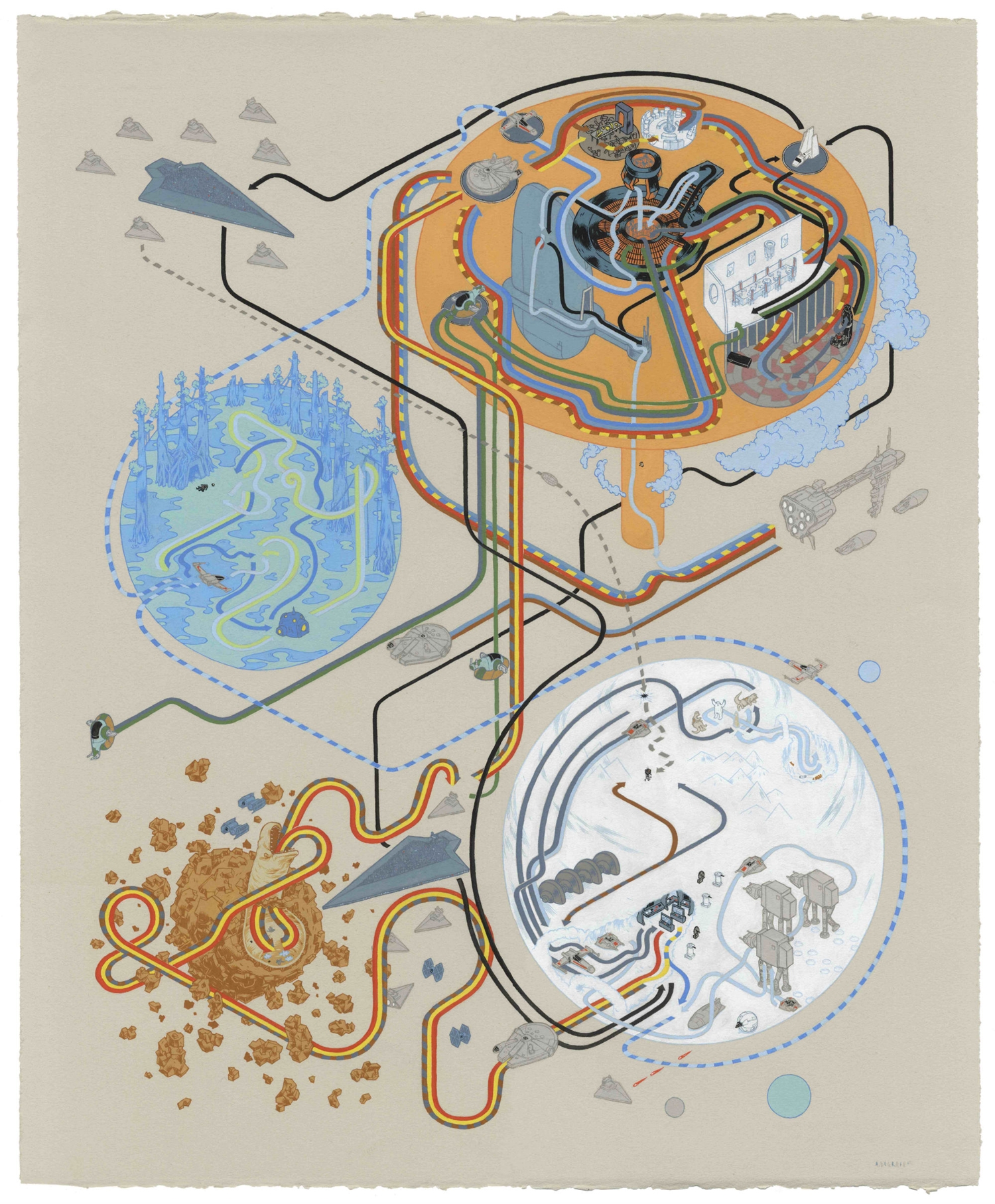
Slashfilm reports that the Star Wars maps were created by DeGraff for an upcoming show featuring his work alongside that of artist Bennett Slater. The Star Wars maps aren’t the first time DeGraff has experimented with this idea; he previously created map versions of Shaun of the Dead and Hitchcock’s North by Northwest. Here’s his rendition of The Empire Strikes Back.
If you’re digging the cut of DeGraff’s jib and live in the Los Angeles area, you can check out his show at Gallery 1988 Melrose beginning this Saturday, January 5th. Finally, here’s DeGraff’s Return of the Jedi.