Star Trek’s Latest Retro Posters Have Giant Monsters And Doppelgangers
This article is more than 2 years old
 Artist Juan Ortiz is back with another four of his excellent Star Trek retro prints. If you’ve somehow managed to miss the eight zillion other posts we’ve done about the preceding prints, here’s the skinny: Over a year ago, Ortiz set out to create an original, retro-style art print for every single one of Star Trek: The Original Series’ episodes. Even though the show only ran three seasons — a brief lifespan when measured against the later spinoffs — that’s still a damn lot of work. Now he’s back with the latest installment highlighting four more TOS episodes: “The Galileo Seven,” “The Enemy Within,” “Wolf in the Fold,” and “The Apple.” We’ll have info about how to order the prints at the bottom.
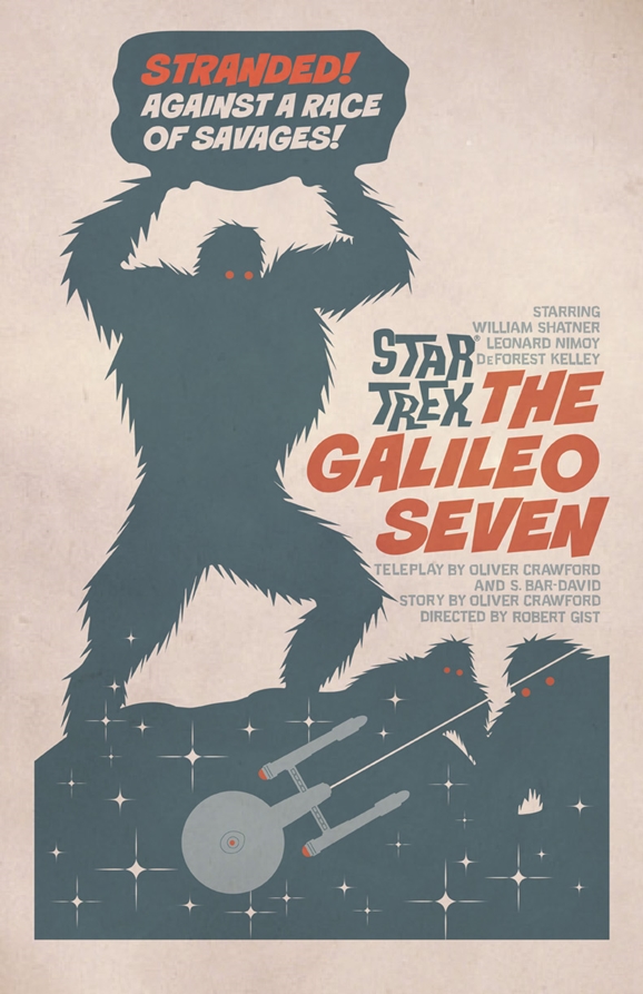
Since these aren’t exactly the most famous of the show’s episodes, we’ll take a look at each one individually. First up is “The Galileo Seven,” the poster for which can be seen up top. Originally aired on January 5, 1967, “G7” is the sixteenth episode of the show’s first season. In it, a shuttlecraft crew including Spock, McCoy, Scotty, and four other specialists crash land a shuttle on a planet they were attempting to investigate. With the Enterprise itself needed to deliver medical supplies to a colony elsewhere ASAP, the shuttle crew is left to try and survive attacks by giant, spear-wielding natives and find a way to get the hell off that planet before they all die. Here’s what Ortiz had to say about the “Galileo Seven” print, via StarTrek.com.
Your art for ‘The Galileo Seven’ is very stark, just a few colors and a lot of white space. Take us through your inspirations and design choices for this piece.
ORTIZ: It’s been compared to an episode of Lost in Space, where the Robinson family encounters a giant cyclops. That’s actually because the Star Trek episode brings back memories of the Lost in Space model kit that I had as a kid, which is what the poster is based on.
First airing on October 6, 1966, “The Enemy Within” was the one where a transporter mishap splits Kirk into two beings: a wishy-washy wuss who hates confrontations and an overly aggressive asshole who raids Sickbay for Saurian brandy and tries to sexually assault Yeoman Rand. Yikes. The episode was penned by none other than Richard Matheson, the writer behind such genre classics as I Am Legend, The Shrinking Man, and Bid Time Return (which served as the basis for the movie Somewhere in Time, starring Christopher Reeve and Jane Seymour).
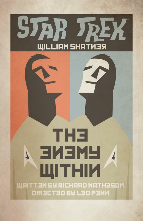
’The Enemy Within’ has a ‘mirror’ feel to it and also a Russian sensibility. First, are we right about that? And second, break down the graphics for us.
ORTIZ: Yes, this image is Russian-inspired. There’s not a lot going on in this one. I did mirror the image. But it’s the mirrored font that really makes this one unique from the rest.
Next is “Wolf in the Fold,” where Mr. Scott becomes the prime suspect for a series of killings that were actually carried out by an evil entity that was behind unsolved murders on numerous worlds, including those of Earth’s Jack the Ripper. (Before or after he was abducted by the Vorlons?) It first aired on December 22, 1967, midway through the show’s second season. As with “The Enemy Within,” it was written by a well-known author: Robert Bloch, whose book Psycho was adapted into the iconic Alfred Hitchcock movie of the same name.
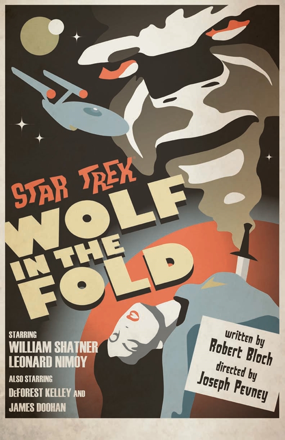
’Wolf in the Fold’ is particularly vivid and busy, and it has a horror movie poster feel to it. What were you aiming for with this design?
ORTIZ: This one was inspired by the horror movies of the 40’s through 60’s. I wanted more of a ‘B’ movie feel for it, rather than a very detailed illustration from the Universal movies.
What compelled you to include James Doohan’s name in the credits? And did you have to lobby to be able to show the dead body and/or the knife plunged into it?
ORTIZ: This is the episode where Scotty is the prime suspect in the murder of a belly dancer on Argelius II. I was careful not to get too graphic with the knife. I made certain there was no blood, but instead placed a red planet behind the female crew-member, to evoke the blood. The mist coming from the knife that turns into a face… that adds a more fantasy element to it.
First aired on October 13, 1967, “The Apple” has the Enterprise encountering a world that seems to be a paradise, but which proves particularly lethal to an away team. They soon find a village full of the world’s native primitive inhabitants, who have been worshipping a “god” that actually proves to be a computer entity that doesn’t take kindly to the Starfleet visitors.
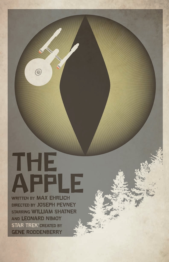
Up next is ‘The Apple.’ What were you shooting for with this one, particularly the eye-like image that dominates the piece?
ORTIZ: This one started with a full image of Vaal, the snake-headed computer, being fired upon by the Enterprise. But I was also inspired by the word “apple” in the title. So the serpent’s eye represents the snake from the Garden of Eden.
If you were going to display one of these on your wall, which would it be and why?
ORTIZ: I may go with ‘Wolf in the Fold.’ I like the colors and the simple depictions of the elements.
You can order Ortiz’s Trek prints at the StarTrek.com shop, where a set of four will cost you $34.95. If you’re across the pond in the U.K., you’ll be able to get them from Amazon.co.uk, ForbiddenPlanet.co.uk, and Oneposter.co.uk. You can see our stories about the earlier prints right here.