It’s Spock Against Spock In The Latest Batch Of Star Trek Episodic Posters
This article is more than 2 years old
I have to say, I’m going to be sad when artist Juan Ortiz wraps up his ambitious project of creating posters for every single episode of Star Trek: The Original Series. Sure, we get to cover a lot of really cool artwork here at GFR, both from fans and pros. But with Ortiz’s never-disappointing retro Trek prints, I always know that the beginning of each new month will bring another shipment of awesome. Oh well, maybe he’ll move on to the spinoffs (although we wouldn’t blame him for taking a long vacation once he’s done).
Here are the four new posters, covering “Mirror, Mirror,” “The Tholian Web,” “Miri,” and “The Savage Curtain,” along with Ortiz’s commentary from StarTrek.com.
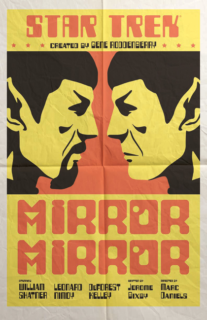
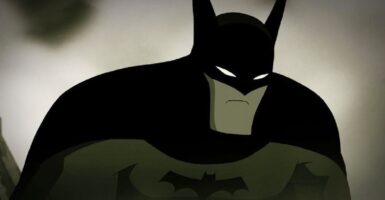
The first January print is “Mirror, Mirror.” We love how clean and simple it is, and the boxing match flyer style. Was there anything specific that inspired your choices on this one?
Ortiz: It was the boxing match flyers that inspired me. I don’t usually lean towards bold colors, but this time it works to reflect the excitement that a boxing match usually evokes. I chose the two Spocks because of the way “evil” Spock’s iconic goatee strongly contradicts good/regular Spock.
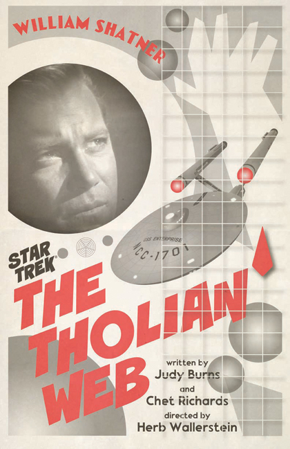
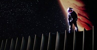
“The Tholian Web” print is very striking. Take us through your choices: the photo of William Shatner, the white spacesuit, the bold red lettering, etc.
Ortiz: This one, and several others, were inspired by the Russian film posters of the mid 1920’s to early 1930’s. What I like about those posters is their mix of photos along with illustrations. Which is perfect for me, because I don’t want to be bogged down with just one style. Since I went with a black and white image, I went with the red on the title so that it would pop. I think the font mirrors the style of the spacesuit, a bit.
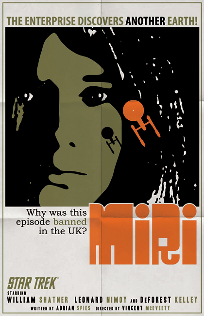
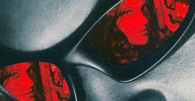
What were you aiming for with the “Miri” art print?
Ortiz: I was hoping to convey a sense of melancholy. The tears from her left eye were originally going to be scabs from the planet’s virus. Likewise, the hair along the right creates an almost waterfall or a river of tears effect. I also wanted Miri to be as special as Kirk thought she was, so I made her larger than life against the Enterprise.You have a lot of advertising-style copy on the “Miri” art print. What went into the decision to go that route?
Ortiz: The extra copy was a design decision. During my research into this episode, I discovered that it had been banned in the UK for two decades. That seemed like an interesting bit of info to tease in a poster. I’m not sure exactly why, but there is a certain amount of violence and kids watching were probably afraid of what puberty might hold for them.
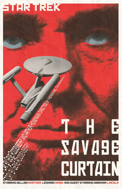
“The Savage Curtain” is incredibly eye-catching, with the bold red, the upward-staring eyes and the vapor trail of credits. Explain those choices: the red, the eyes and the vapor trail of credits.
Ortiz: There is that great image of Lincoln when he appears to the Enterprise, out in space. I thought I would take that and tie it in with the title, turning Lincoln’s visage into a huge red “curtain.” The credits as vapor trails was a way of creating movement, by reading them into the image, along with the Enterprise.If we only let you put one of these four prints on your wall at home, which would it be and why?
Ortiz: I think “Mirror, Mirror” would look good on the wall. It’s a great episode and the bold colors will make it a focal point.
U.S. fans can order the prints — $34.95 for a set of all four — from QMxOnline. If you’re in the U.K., you can grab your copies from Amazon.co.uk, ForbiddenPlanet.co.uk, and Oneposter.co.uk.
You can see the earlier prints via these links: August, September, October, November, and December.