The Matrix Gets A Pulp-Paperback Makeover
Growing up, I spent hours exploring my dad’s collection of old science fiction paperbacks from the ’50s and ’60s. My youth was spent amongst the stars of my imagination, with names like Robert Heinlein, Andre Norton, and Isaac Asimov as my guides. To this day, that unmistakable scent of old paper will knock me flat with nostalgia, and as much as I love reading new books on my iPad, that experience is missing a certain primal something.
And one of the things I miss most? The artwork. I loved those faded, cracked book covers, each one presenting some new, amazing sight that shaped my imagination and creativity for decades to come. Sure, they were often cheesy, and they’re nowhere as slick as the professional SF covers you’ll see lining the shelves at Barnes and Noble, but that was part of their charm.
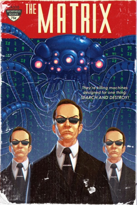
That’s why I’m kind of in love with this image posted by illustrator Timothy Anderson over at his blog. In case you’ve ever wondered what the Wachowskis’ Matrix might have looked like as a 1950s pulp paperback, wonder no more:

As much as I love the basic concept here, it’s the little details that really sell it. The cracking/weathering effects on the “cover.” The intentionally over-the-top slugline. The fact that the hypothetical book is being put out by “Morpheus Books.” And now that I think about it, is it just a coincidence that the artist’s last name is Anderson…or is that just what they want you to think? We’d better take the red pill and see how deep this rabbit hole goes…


