A New Batch Of Star Trek Retro Posters Cover Arena, The Naked Time, And More
This article is more than 2 years old
I’m going to be really sad when the run of gorgeous Star Trek original series retro posters eventually runs out of episodes to cover. If you’ve been following GFR in recent months, you’ll remember that, back in August, artist Juan Ortiz began a very cool project: creating new retro-style posters for every single episode of Star Trek’s three original seasons. The new batch has arrived, and they’re just as gorgeous as the ones that came before. The only problem: we’re all going to run out of wall space before Ortiz runs out of posters…
You can read a full interview with Ortiz over at StarTrek.com, but we’ve got the four new posters, and his thoughts about each of them, below. This month he’s covering the episodes “Arena,” “The Naked Time,” “A Taste of Armageddon,” and “Spectre of the Gun” (a great design for a mediocre episode, in my humble opinion). You can also check out the previous posters here, here, here, and here.
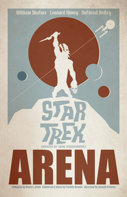
Let’s start with “Arena.” You went with very basic colors here. What went into that choice?
Ortiz: Normally, I would have filled in the silhouette and left the background bare, but I took some chances with this project and went with decisions that I normally wouldn’t go with. Most of my commercial work is filled with bright, bold colors in a sea or products that all scream “buy me,” but for myself, I prefer Earth tones.The Gorn is far more lizard-like and modern than the plodding creature in the episode. What led you to depict him so differently?
Ortiz: Fortunately for Captain Kirk, his Gorn moved in slow motion. My Gorn represents what he may have looked like if TOS had today’s budget and special effects technology. The inspiration came from the sword and sorcery paintings that I used to ogle over as a teen, by Frank Frazetta.
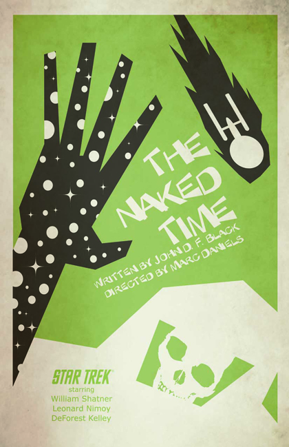
What were you aiming for with “The Naked Time” print?
Ortiz: First and foremost, I wanted a strong graphic image. I opted for the opening and final scenes where crewman Joe Tormolen comes into contact with the virus and the Enterprise’s plummet at the end of the episode. I literally took my idea from the title and “stripped” off the outer layer of crewman Tormolen’s own hand to expose the hand of time and space. The skull could either be a foreshadow of Tormolen’s death or it could be a representation of the affliction reflecting off his visor.
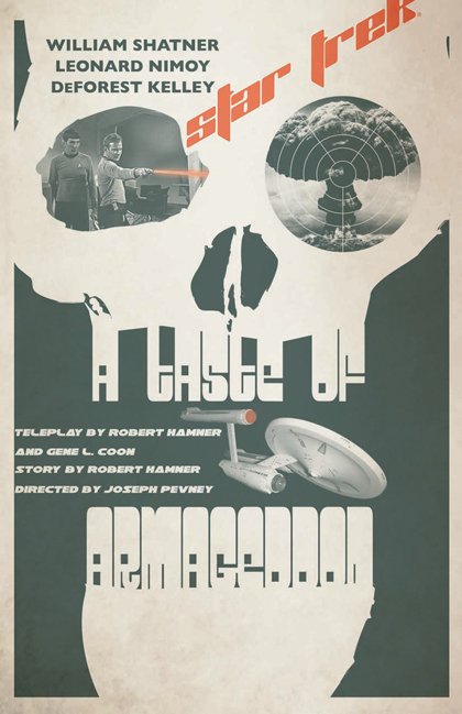
Our favorite of the four this month is “A Taste of Armageddon.” It’s so vivid and stark, and we love the bold color for the show’s title and phaser beam. Plus, you use photographs. Take us through crafting this one.
Ortiz: My initial idea was to depict a face for the computer console with view-screens for eyes, which is why I went with photos for this one. I eventually replaced the face idea with a skull to best represent that episode’s story. I played around with the red accent color and decided to keep it simple with just the show title and phaser beam. The use of the title for teeth is nothing new, but if something works, it’s worth doing again.
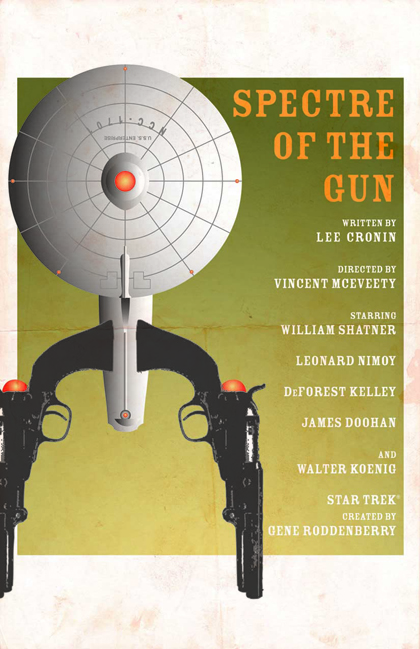
Do you remember the instant you decided to use guns as part of the Enterprise for “Spectre”? How much of an a-ha moment was that?
Ortiz: My very first idea was to create a “wanted” type poster, but I felt it would be a bit too cliche and not a serious depiction of that episode. The guns make a broader and more serious statement. I’m not sure that the use of the guns was an a-ha moment as much as an “I wonder if this has ever been done?” moment. As far as I know, it hasn’t, but if the Enterprise can be a pizza cutter, it can be anything.Of the four, if we only let you put one on your own wall, which would it be… and why?
Ortiz: It would have to be “A Taste Of Armageddon” for the skull and images of Kirk and Spock, of course.