Star Trek Retro Posters Celebrate Green Ladies And Silicon Creatures
This article is more than 2 years old
My unabashed love for the retro Star Trek posters created by artist Juan Ortiz is well established here on GFR. He’s been cranking them out, four per month, for around a year now, and each new batch shows the same creativity and vision as the first. If you’ve missed the earlier stories about Ortiz’s project, he’s been creating one original poster design for each of Star Trek’s 80 Original Series episodes. This time around we’ve got images for “The Devil in the Dark” (the one with the Horta), “Tomorrow Is Yesterday” (the one where the Enterprise travels back in time to 1969), “Whom Gods Destroy” (the one with the hot green ladies), and “The Lights of Zetar” (the one with the Lights of Zetar).
As always, StarTrek.com has premiered the new posters along with some commentary from Ortiz about his thinking and approach for the project. Check ‘em out below, and then we’ll have info about how you can order prints at the bottom of the story.
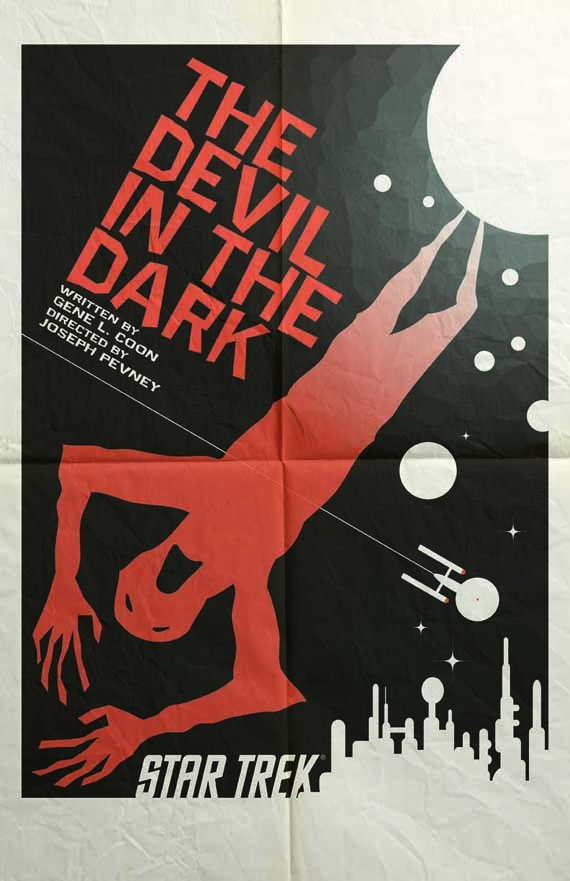 OK, up first among this month’s TOS Art Prints is “The Devil in the Dark.” It’s very stark and creepy. What were you aiming for with this one?
I always try to design a poster with a new viewer in mind. Elements from the episode are there, and they’re just placed into a design that gives an expression of space rather than being underground.
You went with the Horta’s handiwork rather than an image of the Horta. Interesting choice. Take us through the decision.
For the sake of those that had never seen the episode, I did not want to show the Horta on the poster. As I re-watched ‘The Devil in the Dark,’ the smoldering imprint of a man left on the ground made for a powerful image. It’s reminiscent of the “shadows” left behind by the bombs dropped on Japan.
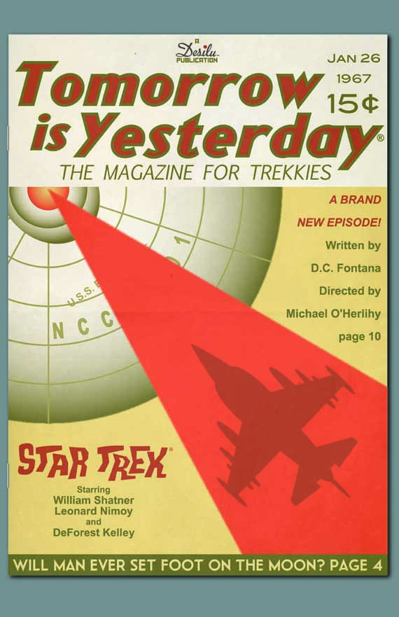 Up next is “Tomorrow Is Yesterday.” What inspired you to go with a magazine cover?
It didn’t start out as a magazine cover, but the design led me in that direction. It was fun to imagine myself back in 1967 designing a magazine cover with the term Trekkies on it. Trekkies were new back then, so it was nice to finally include them in this poster set. Originally, the blurb on the bottom read, ‘Are The Beatles Time Travelers?’ It may have been a copyright issue, so we went instead with the moon-landing question.
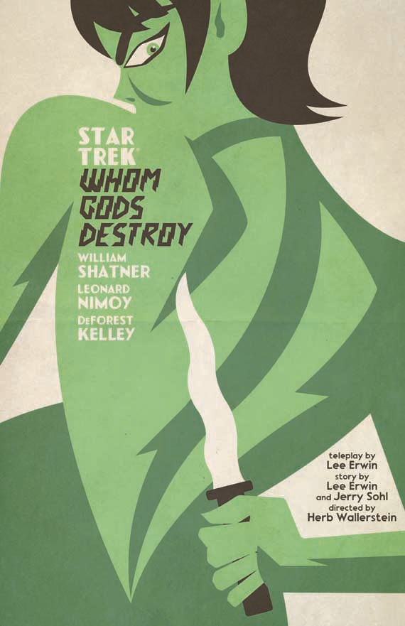 The “Whom Gods Destroy” art is sexy and sinister. How quickly did this one come to you?
This was actually the second design. The first had photos of Yvonne Craig and William Shatner in a Faster Pussycat, Kill! Kill!-inspired poster. CBS did not have the rights to Yvonne’s likeness, so I had to rework it from scratch. Maybe someday the original can be shown.
So how did you go about capturing the sexuality and deadly green-ness of the character?
To avoid any conflict, I went instead with a James Bond-inspired poster. I’m happy with the way it turned out and I don’t miss the original concept at all.
 “The Lights of Zetar” is very colorful and spiritual, almost like Star Trek meets the musical Hair. Take us through the process of creating this print.
It wasn’t until I got to the last scene of the episode that I was able to form an idea for this poster. Once I had it, I had to make sure that the colors didn’t mimic my ‘Trouble with Tribbles’ poster. The idea for a spotlight effect derived from it looking a bit flat. The spotlight and the tiny Enterprise above helps add some depth to it.
Of the four for July, which was the easiest to create and which was the most complicated — and why?
’Tomorrow Is Yesterday’ seemed the quickest. I think it’s because it was the most fun to create. ‘Whom Gods Destroy’ may have been the toughest, but only because it had to be done twice.
Last question: Of the four prints, which would you put on your own wall… and why?
My personal favorite is ‘The Devil in the Dark.’ As you mentioned earlier, it evokes an emotion. I also think it’s a decent layout.
If you’re in the U.S. or Canada, you can purchase prints of Ortiz’s Star Trek retro posters — this set of four as well as the ones that came before — at StarTrek.com. The posters are plate-printed lithographs on “100-pound, aqueous-coated, satin-finish paper.” A set of four will cost you $34.95, and each poster measures 18×24 inches.
If you’re in the U.K., the prints are available “on Wood for £39.99 (43x59cm) and £49.99 (45x76cm), Canvas for £59.99 (60x80cm) and as Framed Art Prints at £49.99 (60x80cm).” Fans across the Pond can pick them up via Amazon.co.uk, ForbiddenPlanet.co.uk, and Oneposter.com.
If you like Ortiz’s poster images and think it would be fun to get hammered while staring at them, you can purchase officially licensed Star Trek wine, each bottle sporting a wraparound label version of one of Ortiz’s posters. They’re only available through the end of the month, so hop to it, you lush.
You can also get a collection of all of Ortiz’s Star Trek prints in one place this fall when Star Trek: The Art of Juan Ortiz is released. It comes out on September 3, and it’s currently available for pre-order on Amazon.