Klingons On Display In Unused Concept Designs From Star Trek Into Darkness
This article is more than 2 years old
When you reboot anything, it stands to reason that your version is going to be endlessly measured against the original, for good or ill. David Cronenberg remade The Fly and we got a masterpiece of body horror. Len Wiseman remade Total Recall and people asked, “Why?” J.J. Abrams remade Star Trek and people asked…well, actually they didn’t so much ask anything as just scream profanity at the screen. Love Abrams’ Trek or hate it, if it has a strength, it’s that it opens the potential to see the fates of the classic Original Series characters playing out differently. Those changes can apply to major things like the history and introduction of one Khan Noonien Singh, or it can apply to smaller elements, such as how you want to tweak those trademark Klingon foreheads.
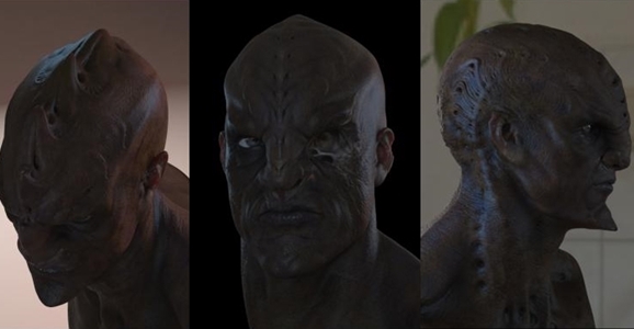
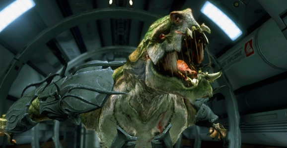
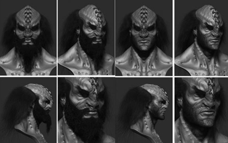
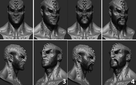
Artist Neville Page is a Hollywood veteran of projects such as Avatar, Prometheus, and TRON: Legacy. He also contributed concept art for Abrams’ original Star Trek film, and returned for this year’s sequel as well. Specifically, he helped conceptual the new look for Trek’s most iconic villains, the Klingons. As seen in the final film (and in the top image above), Into Darkness’ Klingons looked pretty much like their original timeline predecessors. The ridges are a little different — they are wider across the brow than we usually saw with classic Klingons, and the ridges also travel further back over the skull, which is especially noticeable since Tony Todd’s Klingon above is bald. But these are overall just small tweaks to the basic Klingon look. (The Original Series’ initial non-bumpy Klingon design is a whole other can of worms.)
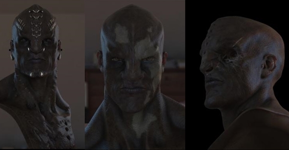
Page’s art reveals variations on the same changes that became the final new look. The head ridges vary in size and prominence. We also get a good look at how the ridges continue down the skull and onto the neck. We also see more of the decorative or ceremonial jewelry, as well as a significantly flattened nose in several of the designs. The changes aren’t massive even in the unused art, but it’s still interesting to see how the film’s designers experimented with tweaking classic Klingon biology.
Here’s what Page has to say about the Klingon project on his website:
JJ Abrams (Mission: Impossible III) was kind enough to have me on board another Star Trek. It was not too dissimilar to the first experience, other than I was too busy to be cast as an Alien this time. Then again, I did go down with the ship in the previous one.
This first round of images are some of the development of the Klingons. This was a very important assignment for me because I knew how important it was to the fans of the franchise. It was a delicate balance of respecting the established looks from previous incarnations yet delivering something appropriate for JJ’s film.
The Klingon designs are likely to prove important in the future films. There have been rumors since the film’s release that the Klingons would be the primary villains in Star Trek 3, and at one point they were going to play a major role in the finale of Into Darkness as well. One way or another, we’re likely going to see more of the Klingons on the big screen in the years to come. You can see more of Page’s designs on his website.
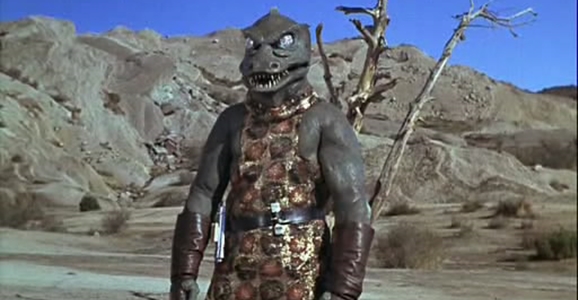
And lest anyone thinks the Klingon redesign is major, the Gorn actually went an ever more significant overhaul for their appearance in the Star Trek video game that released last spring. Before…
…and after.