New Book Design for Orwell’s Nineteen Eighty-Four Keeps Big Brother at Bay
This article is more than 2 years old
One of the best things about past efforts in science fiction is in taking the author’s ideas of the future and comparing them to our own present. And while we may not have full-body teleportation machines or the ability to fuel Matrix-like realities by our body heat, many ideas once thought to be outlandish have come to fruition, though not always for the better. And one of the most prescient ideas in the history of literature is the “all eyes on me” paranoia of George Orwell’s seminal classic, Nineteen Eighty-Four, though referring to years in a non-numerical way never caught on.
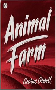
Penguin Books recently re-published five of Orwell’s greatest works, with cover art created by London designer David Pearson, and while the the brash intensity of Animal Farm‘s cover and the no-bullshit black-and-white cover for Politics and the English Language, the cream of the crop is his stark take on Nineteen Eighty-Four.
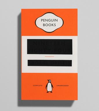
Running the risk of being too obtuse, Pearson’s black-foiled censoring of the author’s name and the novel’s title are immediately eye-catching, especially when set against the bright orange genericness above and below. The design almost comes across as preciously clever, as it’s a direct reference to the novel’s antagonistic Ministry of Truth and its subversive methods of rewriting history to best match the interests of the Party. But risks aside, it’s a striking design that becomes a part of the story itself.
The censor bars aren’t a solid black, though, lest confusion take over your local bookstores. If you look at it from any angle other than dead-on, the words can easily be made out. Pearson explains:
Eventually we settled on printing and debossing, with the difference being that the title and author name were then blocked out using matte black foil. This had the effect of partially flattening the debossed letters, leaving just enough of a dent for the title to be determined –- though I can’t vouch for it’s success on Amazon.
I suppose we can all wait for the re-design of Ray Bradbury’s Fahrenheit 451 as an already-charred book spine, and the perfectly meta re-design of Robert Heinlen’s Red Planet as the fourth planet in our solar system. Books are neat like that.
Here are Pearson’s other designs, for your viewing pleasure.