New Batch Of Star Trek Retro Posters Has Flowers, Salt Vampires, And Splatter Paint
This article is more than 2 years old
If you’re a regular reader of GFR, you’ve probably heard me gush at length about the Star Trek: The Original Series episodic posters being created by artist Juan Ortiz. A few months back, Ortiz announced his plan to create one unique poster for every single one of the original series Trek episodes.The posters are usually very retro, and it’s fascinating seeing which elements of the episodes the artist decides to focus on for the posters.
You can check out the four new posters, as well as Ortiz’s commentary from StarTrek.com, below.
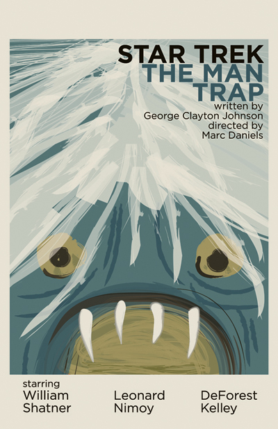
Let’s start with “The Man Trap.” What were you aiming for with this particular print?
Ortiz: I tried to picture what Kirk’s view was while he was having the salt sucked out of him.
It’s a super-tight close-up of the creature, which makes it even more fearsome. Would you agree?
Ortiz: By filling the page up completely, I hope to give the viewer the sense of being smothered or trapped.
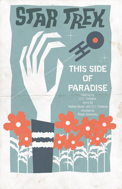
You nail the power of the flowers in “This Side of Paradise.” Did that concept — and having them stand out in such a bold color — come to you immediately, or did this print take several tries?
Ortiz: This was pretty much the first take as far as the layout goes. I may have gone through a few color tries, but that was consistent with all of them.
You’ve made Spock’s hand elongated… and creepy. What went into that decision?
Ortiz: The hand symbolically represents Spock, having rejected love, reaching out from paradise for life aboard the Enterprise and his pursuit of logic.

Great use of the gray in “What Are Little Girls Made Of?” Take us through the design of this print.
Ortiz: Just having Ruk with that title would have been creepy enough, but having his shadow loom over Andrea creates more drama. I also thought about Frankenstein a bit while I worked on this one.

“The Immunity Syndrome” is captured chaos. How did you go about settling on the concept, and then, how did you actually paint the piece?
Ortiz: The idea to represent the giant ameba was an easy one. The paint splatters are actually fonts or dingbats. The only laborious part was arranging and colorizing the splatters into a layout that fell into an organized mess.
Of the four, which was the toughest to do, and why? And, correspondingly, is that one your favorite of the four?
Ortiz: “The Man Trap” was probably the toughest because the hair had to be just right, so as not to overpower the rest of the illustration. I wouldn’t say it’s my favorite, though. I do have some favorites among the entire 80 of them, but the four in this set are equally appreciated by me.
In general, do you find that the more you know/love an episode the easier it is to create a piece? Or, do you have find a way to love them all equally in order to do the prints justice?
Ortiz: I started this project out of love and respect for TOS, but ultimately the function of any of the prints is to grab your attention, pull you in and make you interested in the episode that it depicts. Since most of my prints are re-imagined, conceptual or deal with the subtext, even the fans that have seen all the episodes may want to re-watch a few from my perspective and hopefully discover more than what is just on the screen.
You can order a set of the four prints from QMx for $34.95. They also have the earlier sets available.


